

HAYABUSA
BRAND IDENTITY

Case Study

HAYABUSA
BRAND IDENTITY
Case Study
HAYABUSA
BRAND IDENTITY
Case Study
ROLE
ROLE
ROLE
Creative Direction, Brand Identity, System Design, Packaging, Campaign Oversight, Stakeholder Approvals
Creative Direction, Brand Identity, System Design, Packaging, Campaign Oversight, Stakeholder Approvals
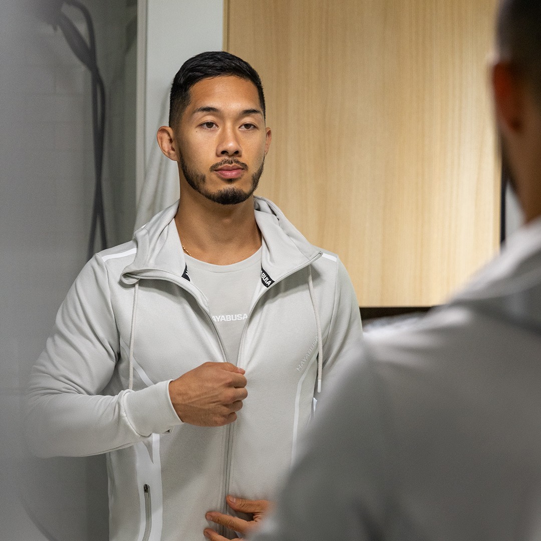
Rebranding a Combat Sports Icon
I led a full rebrand that took Hayabusa from scattered and outdated to premium and focused. We built a system that held up across teams and channels—and gave the brand a real foundation to grow. Retention and conversion improved across the board.

CHALLENGE
CHALLENGE
CHALLENGE
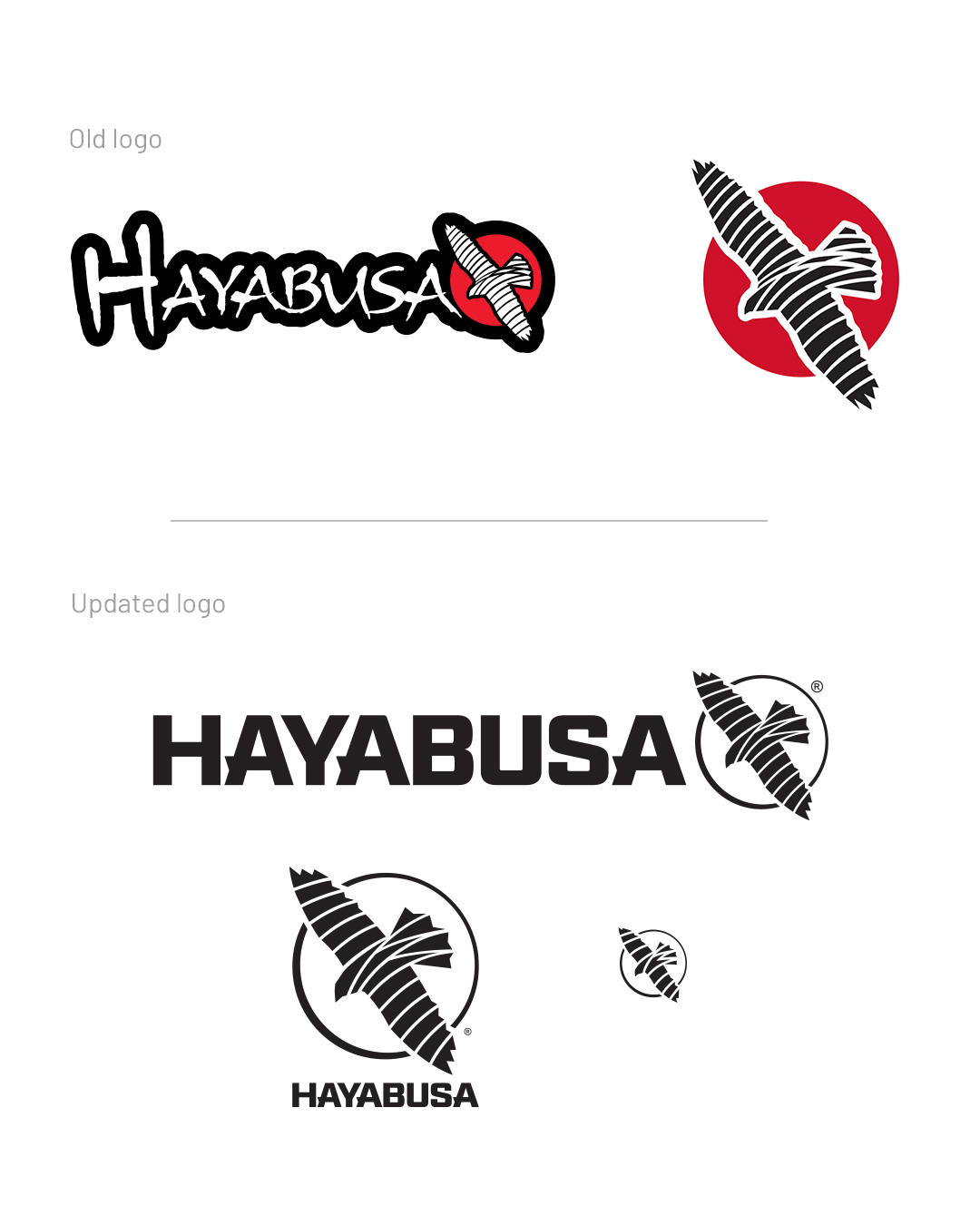
The gear was great. The brand wasn’t. There were too many sub-lines, too much noise, and no clear system. It felt like it was trying to be gritty when it should have been confident. Internally, nothing was consistent. We had to rebuild it from the ground up.
The gear was great. The brand wasn’t. There were too many sub-lines, too much noise, and no clear system. It felt like it was trying to be gritty when it should have been confident. Internally, nothing was consistent. We had to rebuild it from the ground up.
SOLUTION
SOLUTION
SOLUTION

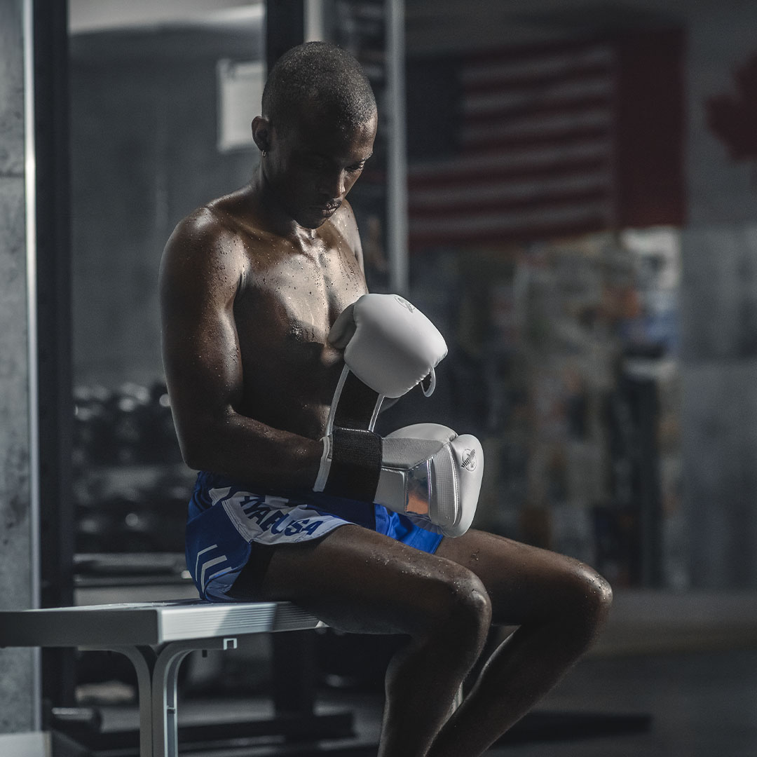
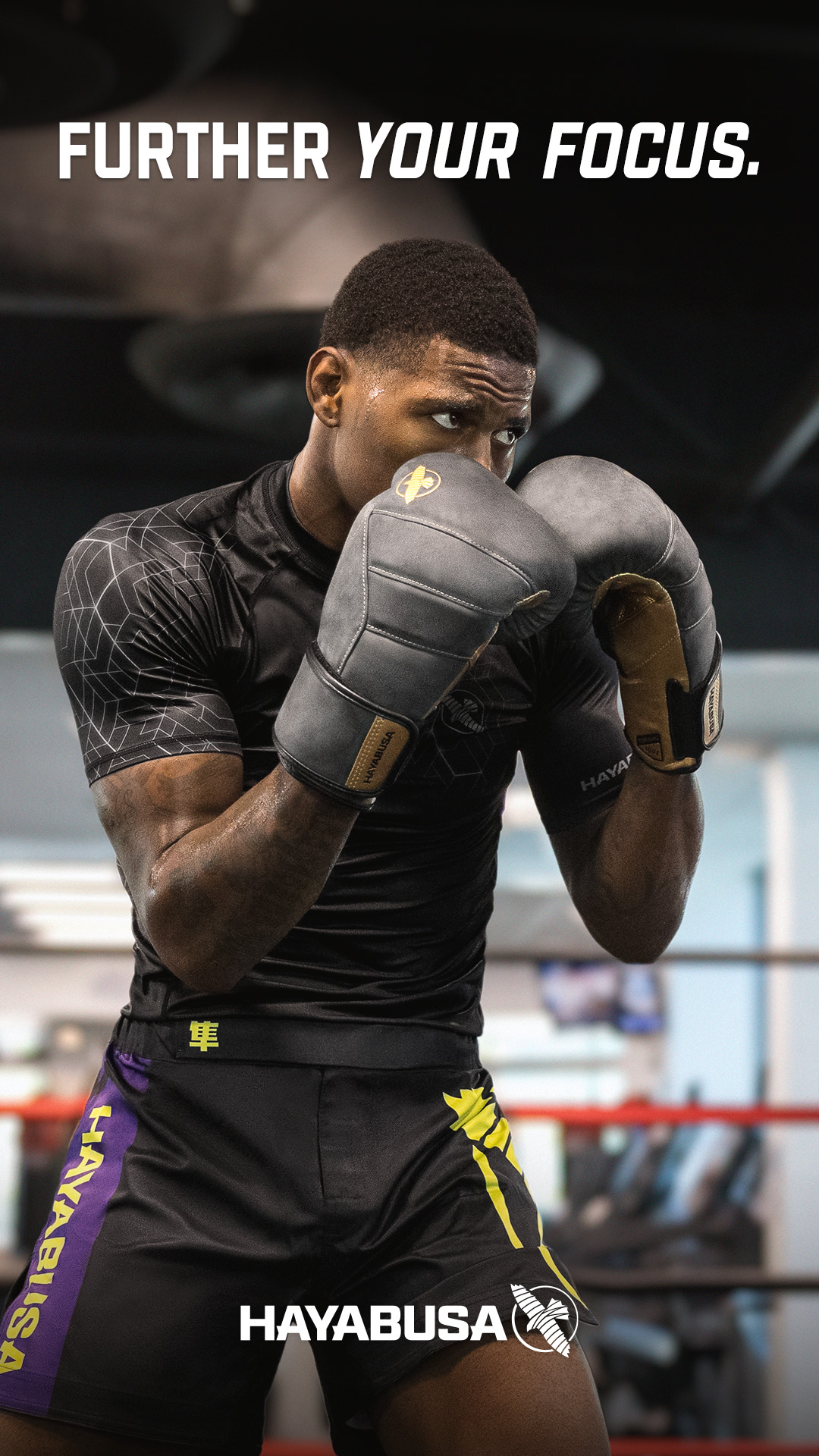
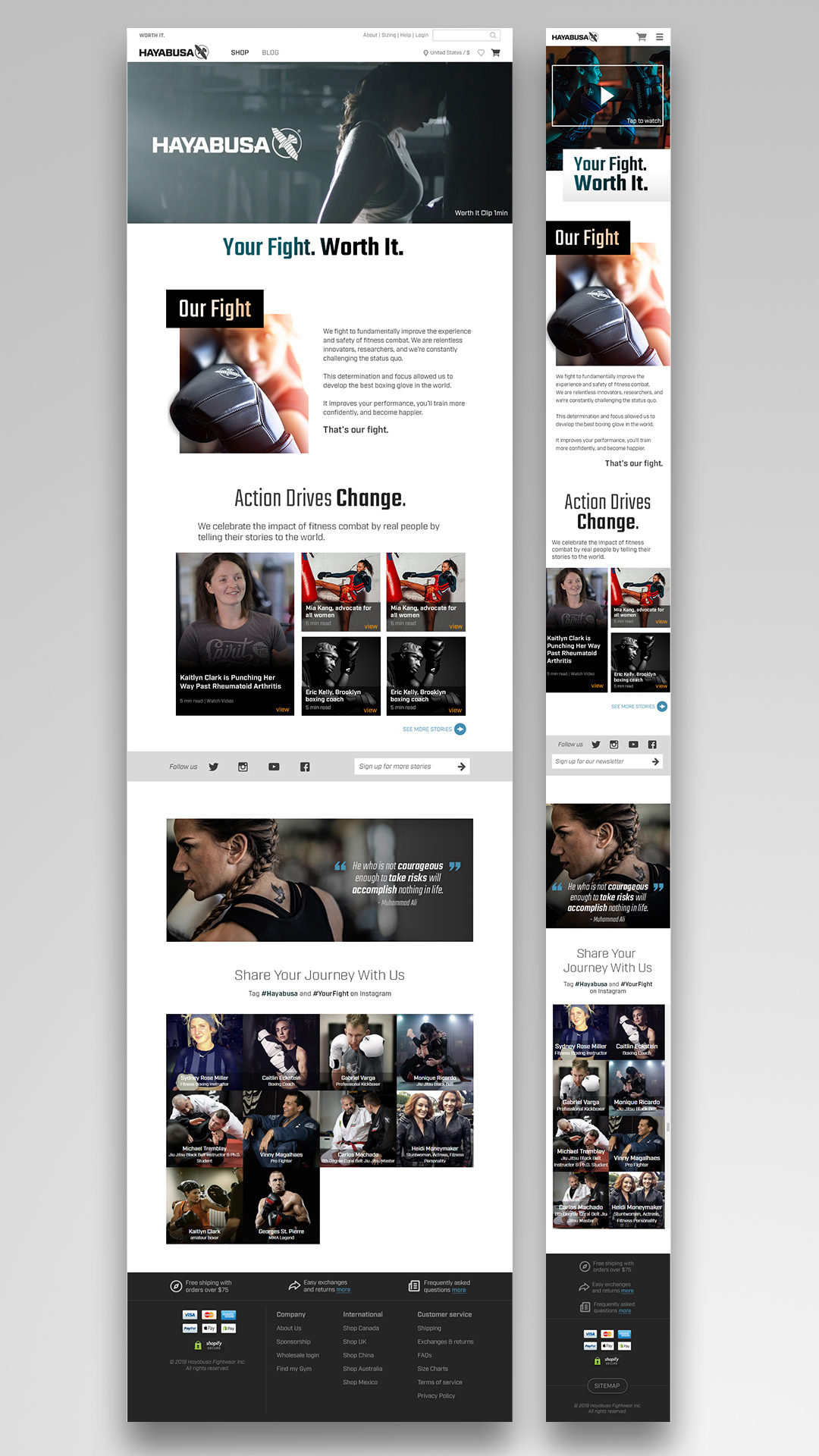
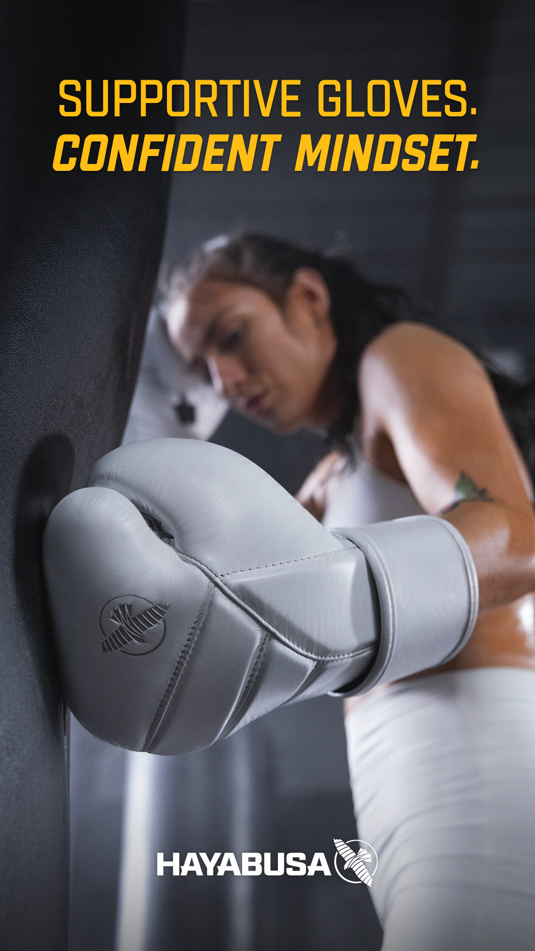
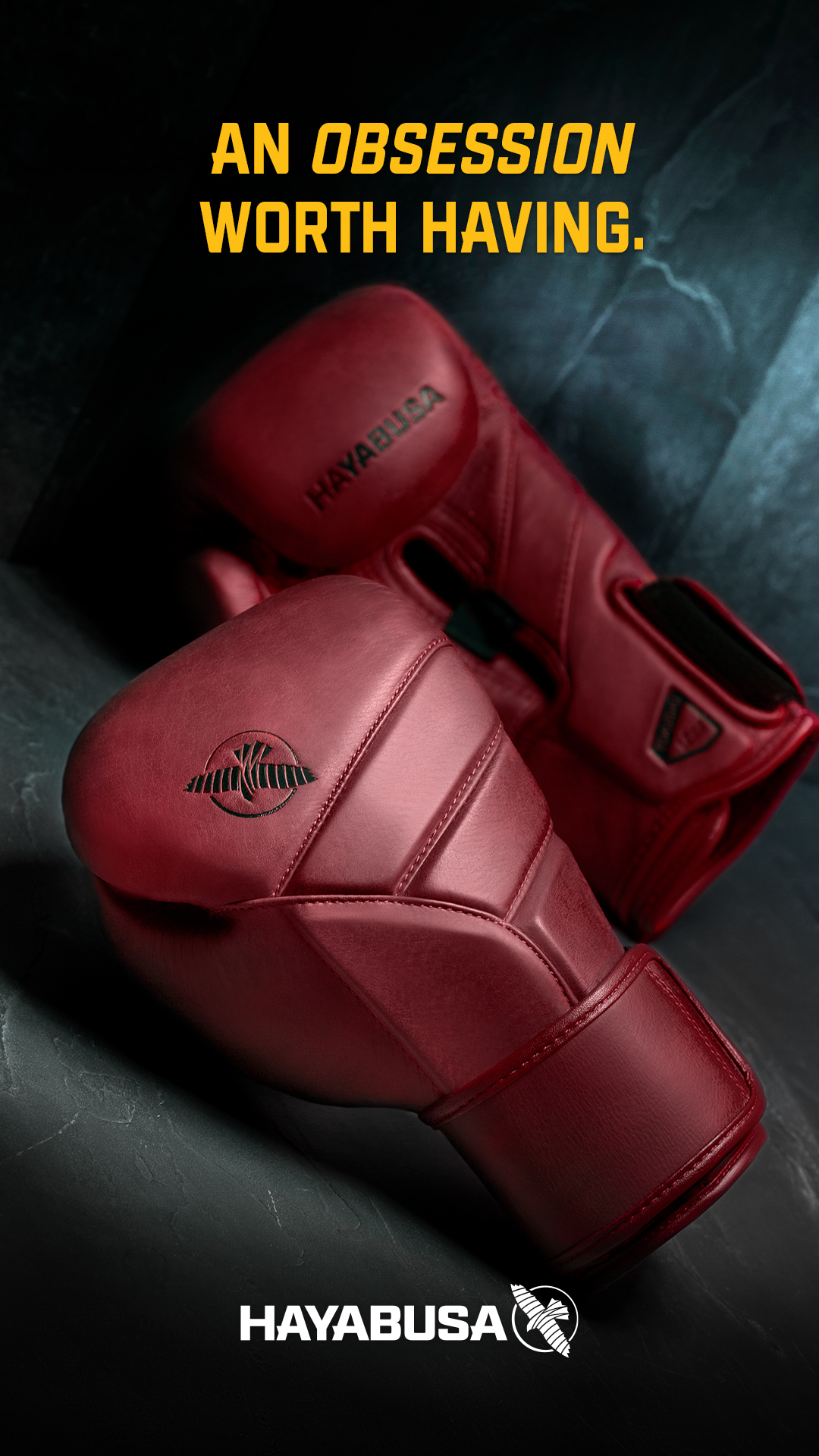
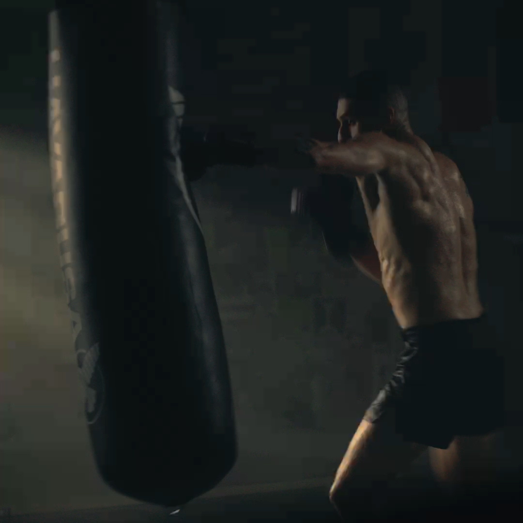
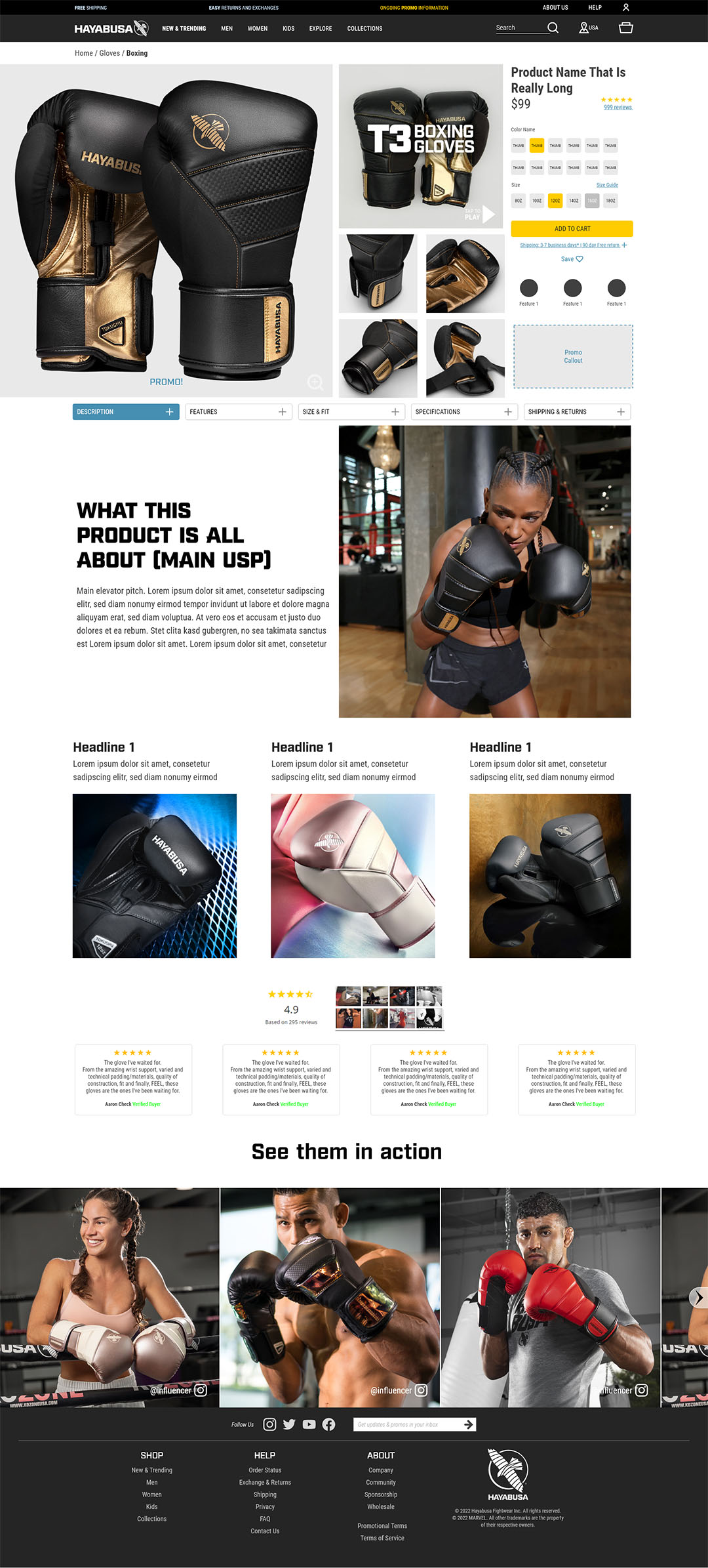
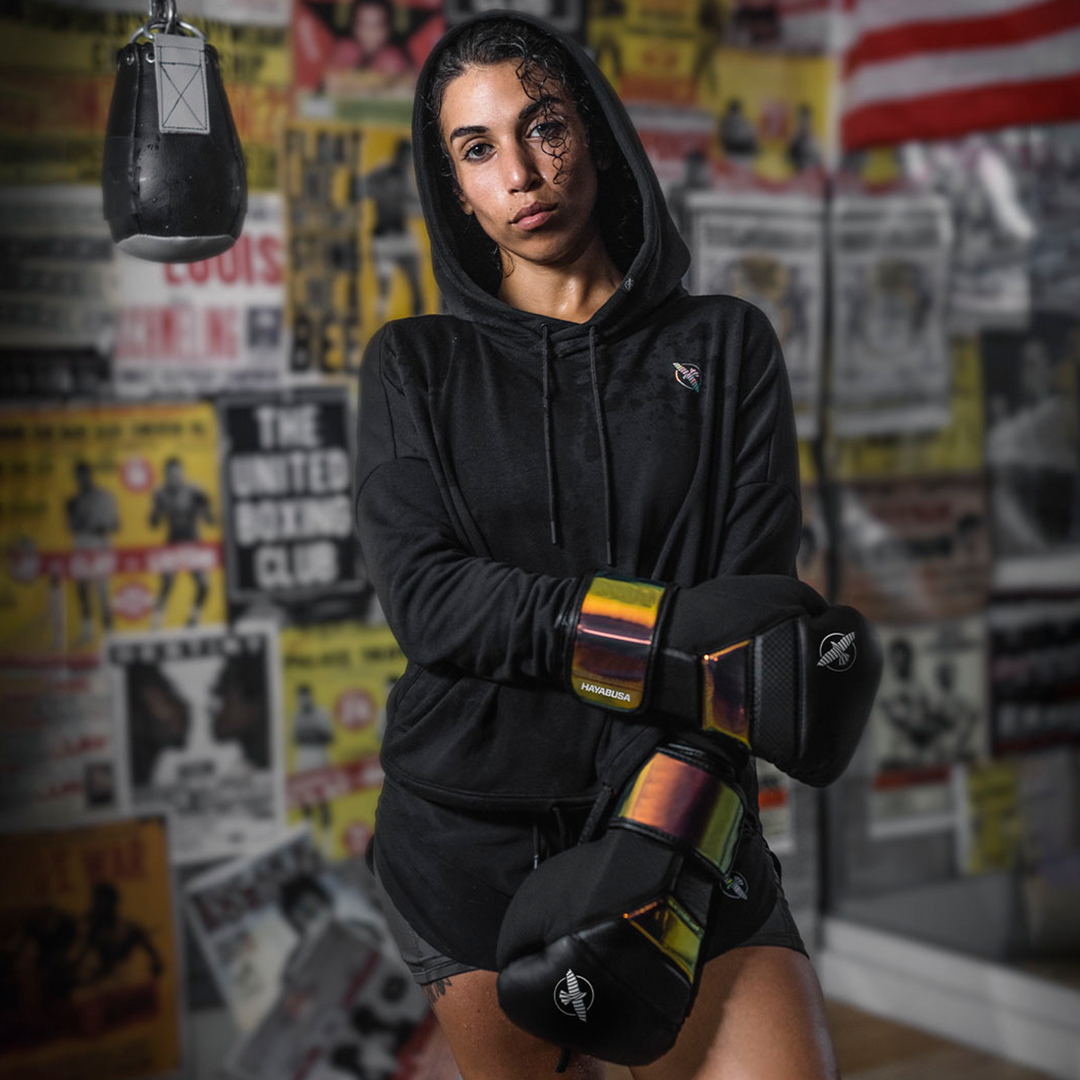
We unified everything under a single brand system. The tone shifted from scrappy to sharp. The logo evolved, the visual style got cleaned up, and every touchpoint worked together. We built assets that teams could actually use. And they did. We also made sure to represent both genders equaly. This new 50-50 gender focus opened up a new market for us in a space where most combat sport brands are mainly male focused 80-20.
We unified everything under a single brand system. The tone shifted from scrappy to sharp. The logo evolved, the visual style got cleaned up, and every touchpoint worked together. We built assets that teams could actually use. And they did. We also made sure to represent both genders equaly. This new 50-50 gender focus opened up a new market for us in a space where most combat sport brands are mainly male focused 80-20.
OUTCOME
OUTCOME
OUTCOME
My Role
Led creative direction for the full rebrand
Rebuilt the visual identity and design system
Directed all packaging, product, and campaign work
Designed scalable tools for ecommerce, content, and social
The Result
The brand finally reflected the quality of the product. Conversion went up. Retention improved. And Hayabusa started earning a spot next to premium performance brands, not niche fight labels.
The brand finally reflected the quality of the product. Conversion went up. Retention improved. And Hayabusa started earning a spot next to premium performance brands, not niche fight labels.
My Take
One of the most rewarding projects I’ve led. We brought clarity and focus to the brand in a way that still holds up today.
One of the most rewarding projects I’ve led. We brought clarity and focus to the brand in a way that still holds up today.

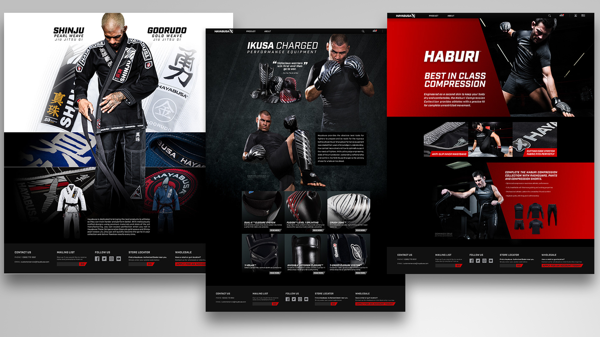
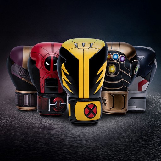
GALLERY
GALLERY
GALLERY

SIMILAR WORK
SIMILAR WORK
SIMILAR WORK


All brand names, logos, and assets are the property of their respective owners. Shown here for portfolio purposes only to demonstrate my role in past projects. Not for commercial use.
All brand names, logos, and assets are the property of their respective owners. Shown here for portfolio purposes only to demonstrate my role in past projects. Not for commercial use.
All brand names, logos, and assets are the property of their respective owners. Shown here for portfolio purposes only to demonstrate my role in past projects. Not for commercial use.